The making of Tuck Everlasting Promotions
Tuck Everlasting was a musical being produced by my friends at The Footlight Club.
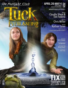
I was tasked with creating their standard promotional package of poster, postcards, banner and a variety of digital assets for social media.
On a flight to the Florida Keys, I went back to the source material and read the original book by Natalie Babbitt. Seemed a bit ironic that I was headed down to the place where the Fountain of Youth was rumored to have been hidden.
Ms. Babbitt’s tale is a quick read, exploring the concept of immortality. The central question is this: if you had the opportunity to live forever, frozen at your current age, would you take it?
The writing in Tuck Everlasting is quick and witty, with plenty of heart.
And, it is aimed pretty solidly at a younger audience. Well, younger than I am, certainly.
The musical, with a book by Claudia Shear and Tim Federle, music by Chris Miller, and lyrics written by Nathan Tysen, takes some liberties in the translation, but maintains that heart throughout the story.
So, right away, we knew the poster needed to appeal to a generally younger age group.
Of course, we also never want to discount our more adult audience members.
Themes and Poster Elements for Tuck Everlasting
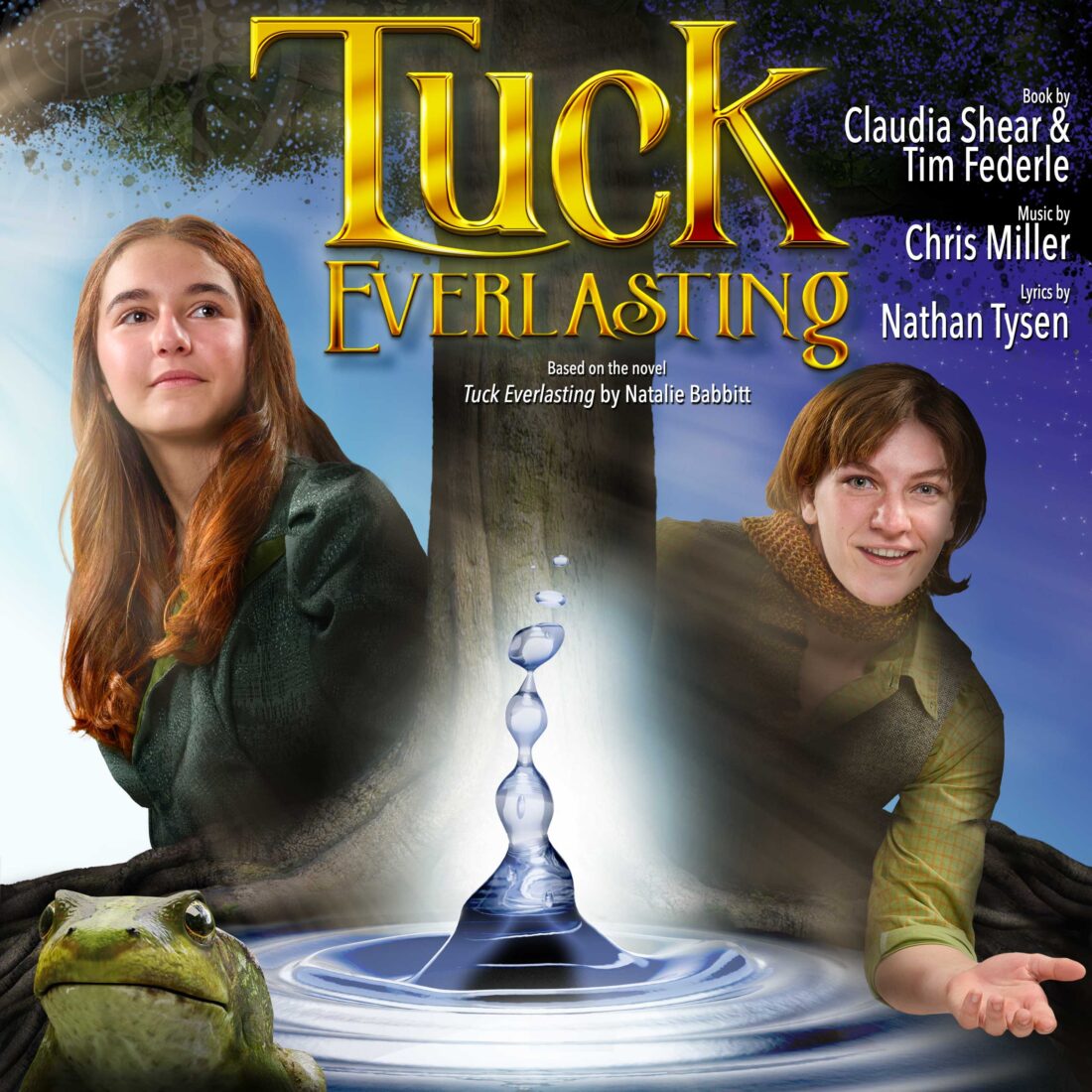
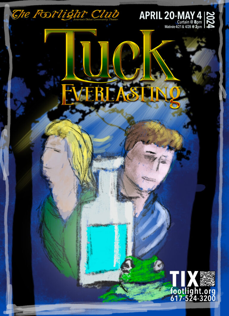
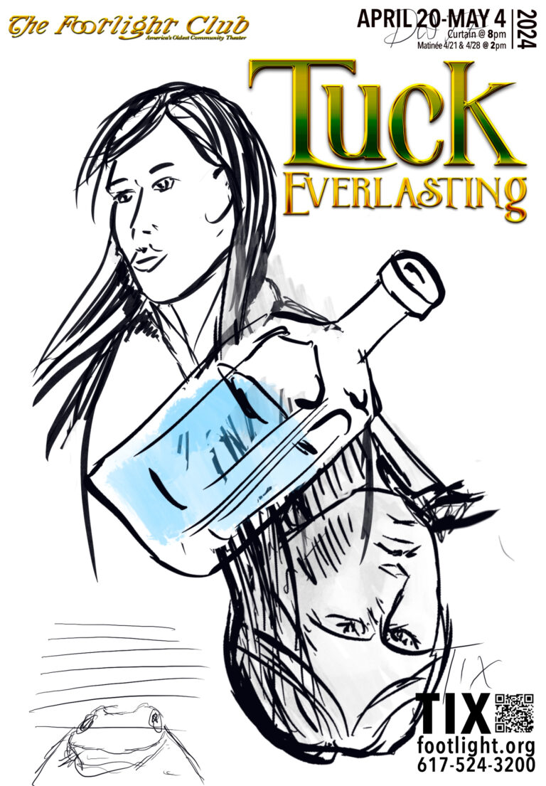
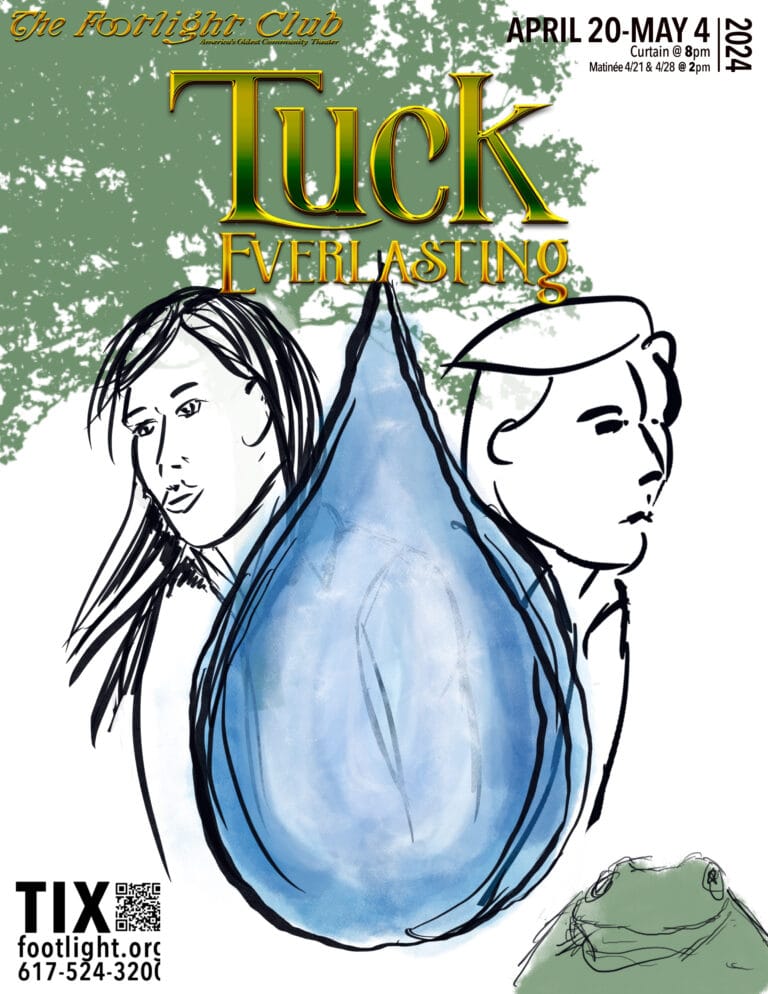
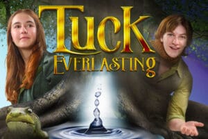
There were several elements that we wanted in the final poster: Winnie, the protagonist that the story follows, Jesse, the youngest Tuck, forever a teenager, and the spring of immortality, under the old ash tree. The toad, who doesn’t have much of a role in the book, other than another example of the consequences of immortality, is also a fun element for our target audience.
I spent a while mulling the possibilities and sketching some concepts on my iPad and considering more of the where the elements would go and how they would work together, rather than how I was going to actually achieve these elements.
During a meeting with the producers, we narrowed down the concepts and general emotions.
And, then the real fun began.
Photoshoots and Collage Elements for Tuck Everlasting
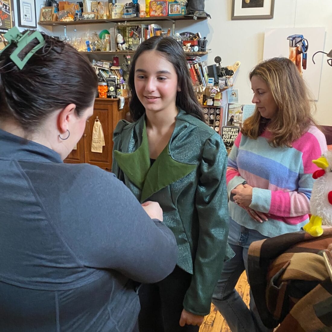
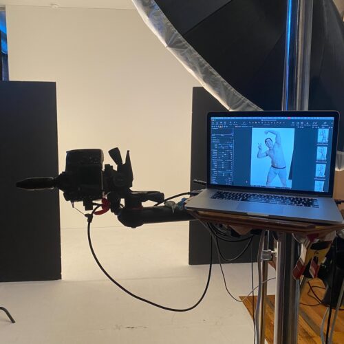
Due to scheduling, we set up two photo shoots. The first was to get the assets for the poster design. The second would be for our character portraits.
During the 1st photo session, we knew that Winnie, played by Adeline DeFeo, needed to look young, optimistic and inquisitive. Jesse Tuck, played by Maggie Post, was a little older, with a touch of the arrogance of youth. Since we knew the order on the poster, and had an idea of what the final lighting should look like, we lit the photography set with some nice edge light and then got to playing with the characters on camera.
Liza Ulrich, the costumer for this production, did a great job on short notice pulling the costumes together. It helped that we knew it was going to be from the waist up.
Additional assets, such as the toad and the water was rendered in Blender. The tree was built from file photos.
The Tuck Everlasting Marketing Layout
One of the more interesting challenges on these theater projects is that the poster is traditionally a strong vertical. And, the second largest marketing tool is a banner that is extremely horizontal, measuring in at 2’ by 10’.
The elements (each character, shadow, splash of water, branch, root and frog on their own separate layer) need to be mobile enough to be moved around the layout according to the demands of each layout.
And, the contractually obligated author information and theater’s credits becomes yet another series of elements that get chased around the artboard.
The final count on layers, counting the collage of the tree and roots clocked in somewhere around 150 layers on this one.
Supporting Live Theater!
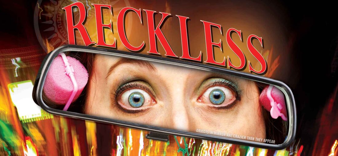
At last count, I have created over 70 posters over the years, for a wide variety of productions.
Like any client, theaters have their own unique challenges and rewards.
The biggest reward, for me, is helping to support live theater, especially at this level.
Go out and support your local community theater, whether it is buying a ticket and going to a show or getting involved as an usher, actor, producer or photographer.
You will have so much fun!

