A Picture is Worth a Thousand Words
If a Picture is Worth a Thousand Words…
If wikipedia is to be trusted, A Picture is Worth a Thousand Words was first coined by Henrik Ibsen in 1906. Of course, this is not to be confused with “A Picture is Worth a Million Bucks“. Although that is valid too.
It was made famous by advertising writer, Fred R. Barnard, in the advertising trade journal Printers’ Ink. It promoted the use of images on the sides of street cars for more effective advertising in 1921.
While I have not seen the actual article, I assume that he observed the fact that words are hard to read on a train blurring past you. And, a lot of descriptive copy is even worse!
Today’s web browsing experience is, of course, much faster than those street car banners of days of yore. If I hit a page and it doesn’t grab me in the first 5 seconds, I am out of there!
Therefore, imagery, photography, design, typography all become that much more important to getting your message across quickly and effectively.
The Key to Effective use of Photos is clarity of message
Know what you want to say first! What is one thing that your product does really well. Or, the best in it’s field?
Hone that message down to one or two concepts. Don’t worry about all the other things your product or service can do. Get to that one universal truth.
Now we have a picture worth a thousand words. And, you will catch your audience. Once they have stopped surfing and started to actually read deeper, you can introduce them to other aspects of your product or service.
Magazines have known about this short cut to attention for years. That’s why they start with a huge, beautiful image on the cover. They do it again for the beginning of articles. Even journals, many of whom are not known for pictures, get in on the act by making the article titles big and bold.
What if you have multiple messages for multiple audiences?
Go back and look at the magazines again: It still has one cover shot style that stands out and is recognizable from issue to issue. And, if the publisher really wants to promote different messages to different audiences, they launch a new magazine. It may only be a special issue or it may be a major launch, but each magazine has one central message that is honed and targeted.
Because they know: a picture is worth a thousand words.
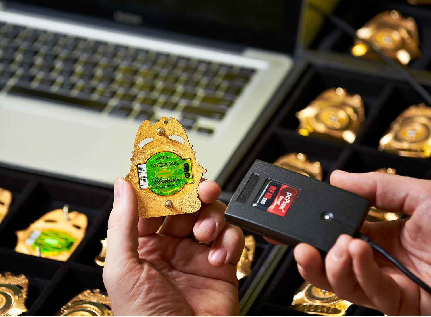
What’s up with this picture? Is it worth a thousand words?
I am often asked to create photographs for web site redesigns. The previous site gets a facelift and a redesign, refocusing it for the target audience.
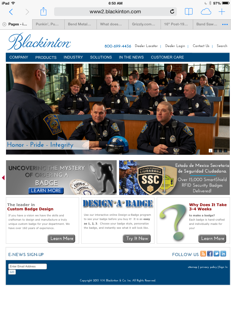
In this case, a 160 year old badge manufacturer was updating its site and the marketing director and web designer sat down and discussed what the company’s brand represented, how the brand would be presented, and what audience the site would be aimed at.
Then, we brainstormed how pictures would tell their thousand plus word stories and what we would need to do to produce them.
The actual production took place at two different locations over the course of one day and, through careful planning, we were able to deliver a new photo library of strong, directed and focused images for the web site redesign.
Related Stories from the Studio . . .
Creating a new Hi Identity Headshot for Glen Hawkins in the studio, under coronavirus safe conditions. Branding doesn't stop...
Hey Ma! I'm on the radio! Check out this interview for Winning Business Radio, where host Kevin Hallinan interviews me about the busines of photography.
A New Year Has Begun Hunter, Tech in Training Have you made your resolutions? Have you broke any yet? As you know,
One of the keys to a great company web site is consistent, awesome company headshots. Here are some tips to make sure your headshots match your brand.


