Spooky Poster for a Spooky Play
The best part of creating the images for a spooky play poster is the opportunity to collaborate with a wonderfully creative team.
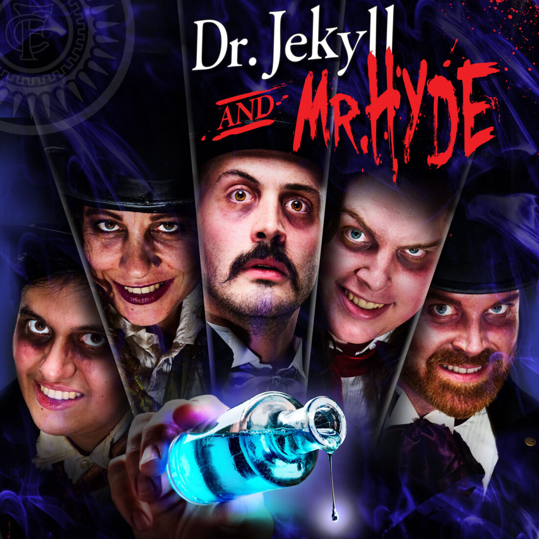
I sat down with director Jill Tokac, producer Jim Ansart and stage manager Sophia Fortuna, to kick off the marketing for Dr. Jekyll and Mr. Hyde at The Footlight Club, America’s oldest continuously running community theater.
As per our usual methodology, we started with the story themes, and Jill’s overall look for the production. It branched into how the images might be used for a postcard mailer, poster for local venues, and banners and other content for the theater’s social media.
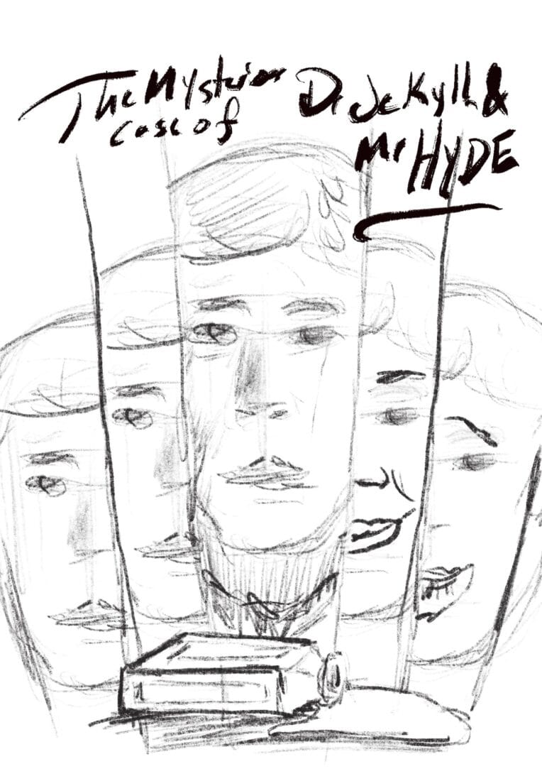
Ideas flowed back and forth. Concepts were scribbled and sketched. “It’s a spooky play. Make it a spooky poster.”
By the end of the meeting, we had a blue print for the poster and character portrait shoot.
Spooky Poster Themes In Preproduction
Most of us have at least a passing familiarity with Robert Louis Stevenson’s Gothic story of The Strange Case of Dr. Jekyll and Mr. Hyde, the novella that defined the gothic horror genre.
The duality of human nature and the struggle between good and evil are the driving themes.
His tale has gone on to influence so much of pop culture. It even is cited by Stan Lee as one of the inspirations for The Hulk.
Planning for a Spooky Play Poster
I started with some horror lighting image searches, just to get in the mood.
Over the years, I have built up an extensive slush library of various posters and images that looked interest.
This led into some research on the spooky photography done by Hammer Films in the 1950s. Which, of course, rolled into the usual internet rabbit hole/time suck.
But, the poster began to form in my head.
And, along with that vision, I could see a path to get the raw photos I would need to assemble the final illustrations.
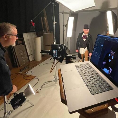
Time to start prelighting in the photo studio and get ready for the actors.
The Spooky Poster Photoshoot
The cast and creative team arrived on a dark and stormy evening.
Well, not really. It was a nice, clear October night. Everyone was in good spirits. And, we got to work.
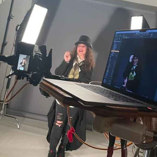
Costumes were ready. Wigs were styled up by WigsbyCaraG. Makeup was applied.
Working with actors on set is always fun.
Since they are already steeped in their characters, and they are used to presenting the core traits to an audience, we can work toward the images we need for the campaign very quickly.
After each actor’s session, we do a quick review to make sure that the images are hitting the tone and story for the poster.
Behind the scenes by Sophia Fortuna
Laying Out Spooky Content
Once upon a time, a photographer mentor of mine said to me, “The audience assumes that everything in your final frame is there on purpose. So, create with intent!”
Of course, we are creating for multiple final frames, depending on the channel. Postcards and posters are usually vertical. The banners are horizontal. And, to mix things up further, there are a few square layouts as well.
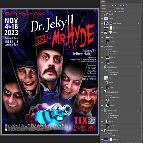
So, each element of information on the poster – the title logos, main images and ticket info – all needed to be coherent and flexible.
With that in mind, I built the elements in Photoshop, being careful to name, and group, the 50 plus layers that made up the end results.
The Results of a Spooky Play Poster
So, what happened next? Well, the marketing team at the theater received a folder of digital assets and immediately began plugging them into their road map.
The square versions went on the theater site as icons to sell tickets. They also popped up on their instagram and Facebook feeds. As soon as that went live, the cast and crew started sharing them as well.
The Facebook event banner went live.
The character portraits were added into posts with cast interviews and scheduled for uploading. As soon as they post, the cast and crew are encouraged to share them with their own networks.
And, the posters and postcards were delivered to the theater’s street team volunteers for distribution.
Currently, ticket sales are booming!

