Creating the Wizard of Oz poster for RTW Boston

There were a number of unique challenges that we faced when creating the Wizard of Oz poster for RTW Boston.
A promotional poster is designed to create a very specific and measurable response in its audience. It is crafted to sell a product, generate curiousity, drive traffic, or otherwise help the viewer to make a decision. The photoshoot for the key art is produced with the single goal of executing that message.
In this particular case, it was to help put “butts in seats”.
The Riverside Theatre Works is a wonderful, community based theater, set in Hyde Park.
With a large main stage, Esmeralda’s Lounge, dedicated crew of people and a passion for introducing the next generation to the performing arts, it has been the jumping off point for tons of performers, many of whom have gone on tread the boards on Broadway or worked in the entertainment biz in la la land.
The challenge they laid out for me this time was their production of the timeless classic, The Wizard of Oz.
Oh, by the way, it is double cast. So, two Dorothys, two Tinmen, two Scarecrows, etc. In fact, there are 80 kids and teens who will take to the stage over the Spring Break.
Cast photos for the Wizard of Oz poster and marketing materials were impractical from both a logistical/budgetary stand point. More importantly, it was way off from a marketing message perspective.
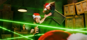
Time for Plan B: create a still life/photo illustration that can work on multiple levels and generate the curiousity factor that will get people to the web site and ordering tickets.
It started with a meeting with Cassandre Charles, the theatre’s acting stage manager, to discuss concepts and scribble up potential layouts. Maggie Dillier, the director, was driving the production in a very interesting, modern type of feel, and we knew we wanted to connect the production back to the community. We also knew we needed some traditional elements, but they needed to be unique to this production.
The heart, medal of courage and scroll seal were hand made for the poster. Bricks were brought in and painted. And, the Emerald City took it’s form from several famous Boston landmarks. The shoot and layout evolved over 2 days in the studio and digital workstation.
At the end of the day, the only reason these posters exist is to pay homage to the dedication and effort that these performers and actors put into these productions and to help the audience to get excited about suspending reality for a few short hours and seeing a live show.