Creating The Poster for In The Next Room or the vibrator play
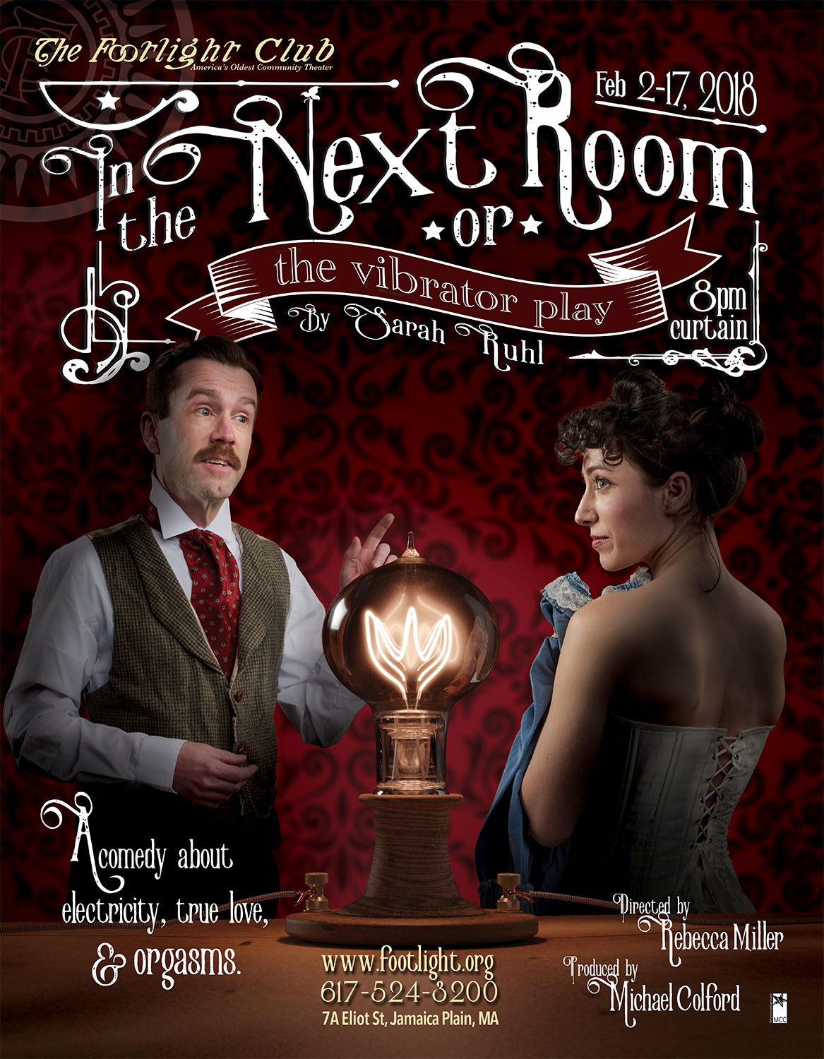
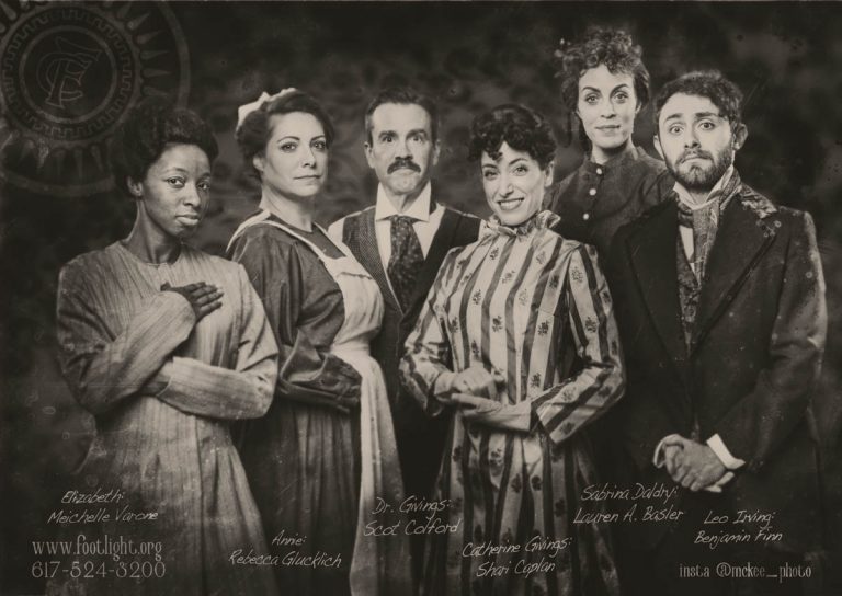
It was great to have some familiar faces back in the studio while we were creating the Poster and Social Media Photos for The Footlight Club‘s production of Sarah Ruhl’s play.
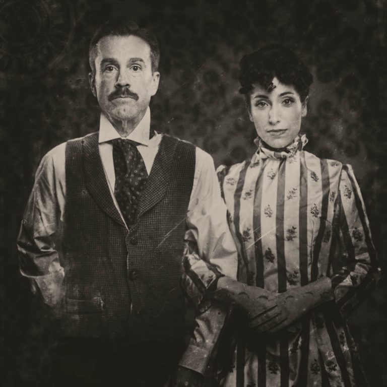
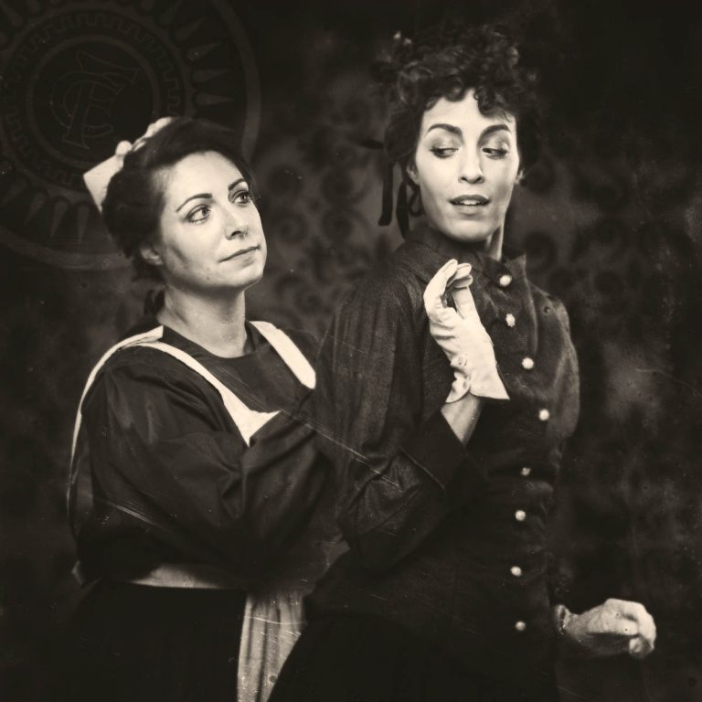
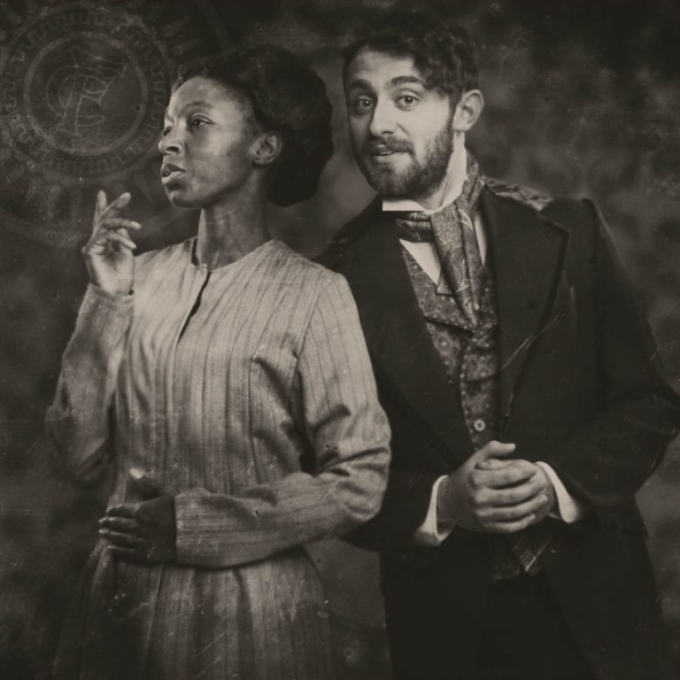
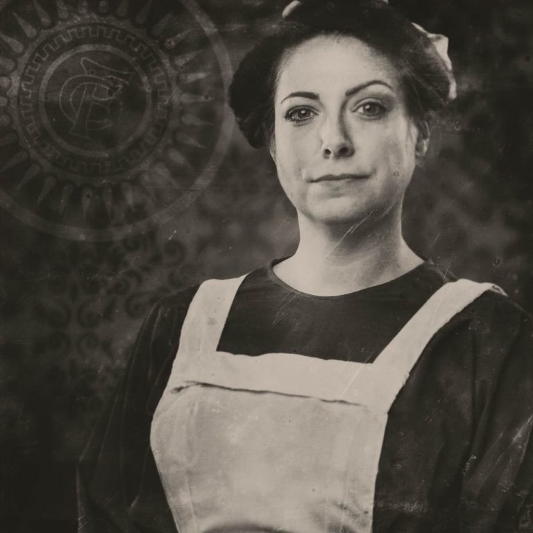
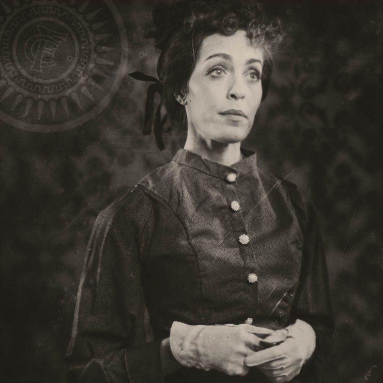
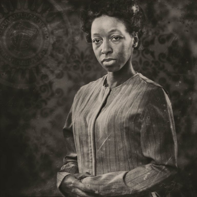
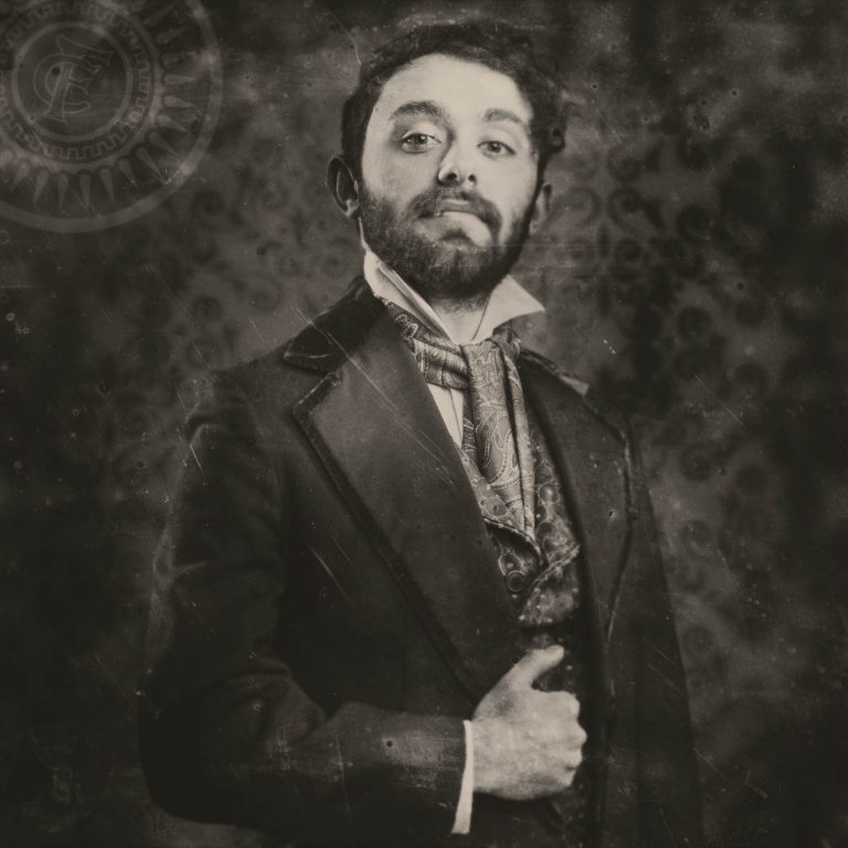
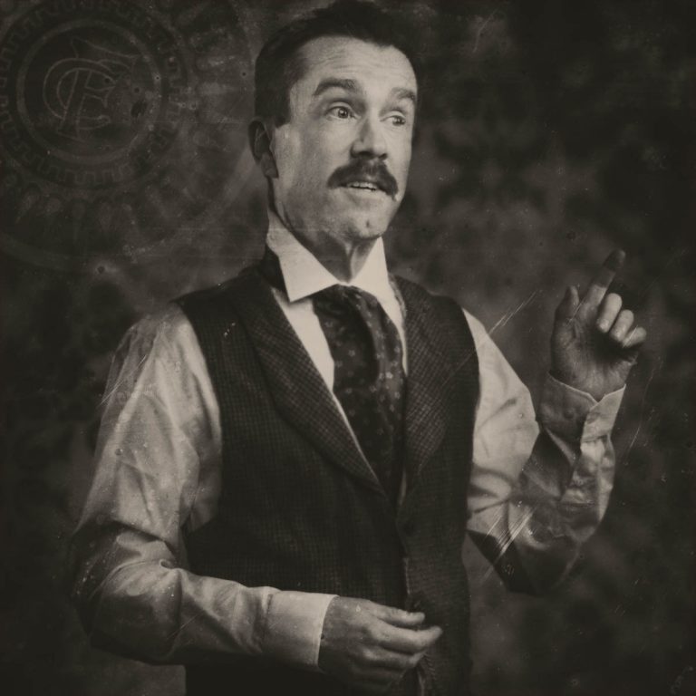
Rebecca Miller, the director, and Michael Colford, the producer, wanted to create a warm, victorian feel for the main poster and then wanted to recreate the feel of tintype images for the social media campaign.
Creating The Props for In The Next Room or the vibrator play
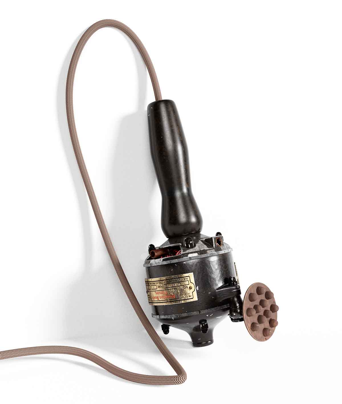
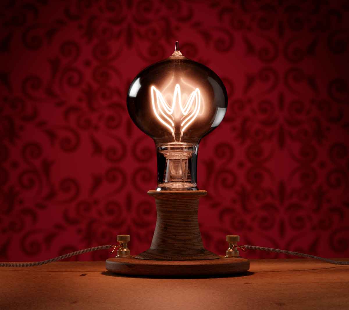
They also wanted to illustrate the date of the play by using a period correct light bulb and vibrator as props. Our challenge was finding those two props quick enough to get the poster out. We struck out there.
The two key props were modeled and rendered in Blender before being composited into the collateral art work.
Creating The Tintype Look
The tintype effect was created in photoshop with multiple layering to create the tone and the selective focus of that historic photo technique.
The tone was created using the gradient mapping adjustment layer. Each element from the background wall paper to the scratches in the glass plate were on their own separate layer for flexibility.
You can see other posters we have created for The Footlight Club here.

